Saturday, November 25, 2006
In our system specifications one of the instructional objectives for photographic composition was: “Given a photograph, the learner will be able to crop it to emphasize the lines (leading, vertical, horizontal, diagonal, or S-shaped) and make the photograph more effective.” I’m having second thoughts about this because cropping a photograph to improve the composition is not the same as taking well composed photographs. I’m wondering if I can find a measure of the learning outcome that reflects more closely what goes into composing photographs. This is one of the weaknesses of an online course that doesn’t have immediate feedback from an instructor. If it was possible to have learners submit example photos for instructor feedback, then the course would be much improved. However, it would also mean a significant increase in cost and one that would continue to escalate as the number of learners increased.
Thursday, November 23, 2006
Sample photograph for cropping


In the top photograph the path tends to lead the eye out of the photograph. Cropping it helps to create a photograph where the path leads in from the bottom left hand corner and draws the eye into the photograph. Note: the photograph itself is not particularly riveting. It was chosen to illustrate how cropping changes a photograph. It should also be noted that photographers should compose their photographs well when taking the photo, rather than relying on extensive cropping afterwards.
Tuesday, November 21, 2006
Theoretical underpinning
Gagne’s Conditions of Learning theory outlines nine instructional events and corresponding cognitive processes:
(1) gaining attention (reception)
(2) informing learners of the objective (expectancy)
(3) stimulating recall of prior learning (retrieval)
(4) presenting the stimulus (selective perception)
(5) providing learning guidance (semantic encoding)
(6) eliciting performance (responding)
(7) providing feedback (reinforcement)
(8) assessing performance (retrieval)
(9) enhancing retention and transfer (generalization).
Many of these fit well with what I’m trying to accomplish in this instructional tool.
Gagne, R. (1985). The Conditions of Learning (4th ed.). New York: Holt, Rinehart & Winston.
In Clark’s techniques for informational instruction she recommends that instructors first make a statement of the principle, then provide a set of varied examples that illustrate the application of the principle, followed by a number of non-examples that illustrate the result of failing to correctly implement the principle.
The function of lines in photographic composition
The mood of a photograph is influenced by the type of lines the photographer includes.
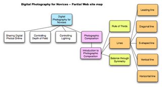
Vertical lines -- imply dignity, height, solemnity, strength, and grandeur. Found in trees, tall buildings or other structures, fences, people standing, mountains, etc. This impression is strengthened when the photo contains multiple lines.
Horizontal lines -- imply calm, tranquility, peacefulness, etc. Found in desert scenes, a lake, meadows with flowers, etc.
Diagonal lines -- add a sense of energy, dynamism and motion to photos.
Curved lines -- add beauty and charm to photographs. E.g. a curved path, bend in a river, or human body.
S-curve -- adds charm, strength, grace, and balance. It is a double curve in a river, path, fence, row of trees, etc.
Leading line -- is a line in a photo that often starts from one of the four corners and draws your eye to the main subject or centre of interest in the photo. It should be used with caution because if the leading line does not lead to an object which stops it, it may lead the viewer’s eye out of the photograph. The preferred starting point for a leading line is the lower left corner of the photograph, although not the exact corner. This is the area from which the eye finds it most natural to enter a picture.
Friday, November 17, 2006
Presenting information
In keeping with the photographic theme, I’m trying to devise a way to use as little text as possible (or at least to keep it to a minimum), but to explain through illustrative photographs.
I’m hoping this will allow me to use a more inductive style that will develop learners’ abilities to see as a photographer sees. Photographer Freeman Paterson, describes of one of the disciplines of photography as “learning to see”, which is something I want to develop in the learners. This is also why photographers often say the “make” a photograph rather than “take” a photograph.
Glossary -- to help overcome one of the constraints we identified, I’m creating a glossary of technical terms that learners can access from any page in the site.
“Rules” of photographic composition 2
Composition is an area of photography that includes many aspects. Given the relatively short period of instruction for this design concept and prototype, I’ll need to choose the concepts I’ll include and eliminate.
A number of possibilities include: rule of thirds, golden mean (same as the rule of thirds?), balance, texture, rhythm, mergers, space, shape, point of view, perspective, pattern, motion, line (horizontal, s-shaped, vertical, diagonal), framing, contrast & variety, simplicity.
In addition, a number of the areas some photographers contain in “composition” are covered in other areas of photography, e.g., depth of field, motion/shutter speed, etc.
Thursday, November 16, 2006
Lesson Plan
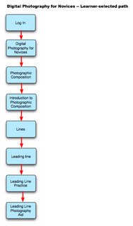
Here are the steps I want the learners to follow when they’re learning about a new technique:
1. Learn to see. Look at a several photographs that use the technique. About each photograph, ask:
-- What was the photographer trying to do with this photograph?
-- Did he/she succeed?
-- What strikes you as effective?
-- What doesn’t seem to work?
-- How could the photographer have improved the photograph?
2. describe the technique -- provide information to the learners about:
-- what the technique is called
-- what photographers say is the technique’s visual effect
3. practice identifying photographs that use the technique.
4. practice applying the technique in your own photography.
Wednesday, November 15, 2006
“Rules” of photographic composition
“Rule” is probably not the best term to use to describe the application of photographic principles. Probably it would be better to use “guidelines” or “tips” because they are not as stringent as the rules for manipulating other areas of photography such as exposure, shutter speed, or depth of field which are governed by laws of physics.
Tuesday, November 14, 2006
Using Photographic Examples
One of the challenges in teaching photography is knowing how to present the information in such a way that it will make sense to the learners.
One way to overcome this is to provide examples of photographs that illustrate the principle under consideration, but also to provide similar photos that show what happens if you violate the principle. The photograph may still be good or interesting, but not as good as it might have been.
These two photographs are a good example of that. The top one is a good example of the rule of thirds where the sunset is in the right third quadrant of the photo. The lower photograph has the sun more in the middle and the boat is also directly aligned with the sun, reducing the effectiveness of the photo.


Saturday, November 11, 2006
Graphic Interface 2
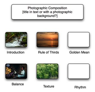
Here’s the second version of my interface. Using photographs as part of the interface makes it much more attractive and reinforces the information I’m trying to teach.
One of the challenges of this type of layout is if I insert a photograph that’s been shot vertically, it destroys the layout. However, I need vertical shots, because framing is a large part of composition. I’ll have to think this one over.

One of the challenges of this type of layout is if I insert a photograph that’s been shot vertically, it destroys the layout. However, I need vertical shots, because framing is a large part of composition. I’ll have to think this one over.

Graphic Interface 1

Here’s my initial plan for the layout of Web page interface. I’m thinking I might put example photographs in the boxes to help learners visualize what I’m trying to teach them.
I’m still thinking about which elements of photographic composition to add to the section. It may turn out to be too large a section if I don’t place some limits on it.
Another question is how to teach principles that are not always cut and dried. Many photographs are effective because they combine more than one technique. Some photos are obviously dominated by one element such as texture, but many are a combination of elements that work well together to make an effective photograph. Others deliberately break the “rules”.
Friday, November 10, 2006
Educational Context
The learners are customers who are novice level digital photographers, and who own a digital camera.
Sociocultural Context -- Learners are:
- ethnically diverse
- able to use digital cameras beyond the basic “point
and shoot” level - interested in creating online photo albums to share
with family and friends
Technical Context
All learners have access to:
- a digital camera
- fast Internet service
- a multi-media capable computer
- photo-editing software
Informational Context -- Learners have:
- at least a high school education
- no formal training in photography


