Tuesday, December 12, 2006
Monday, December 11, 2006
Prototype Revisions
When creating my prototype, I purposely included a number of different designs for the layout, fonts, and images. One purpose was to get reactions from users as to which they preferred before choosing one and making it the dominant theme. My users quickly picked up on this and expressed a clear desire for consistency of design among the various pages. However, they were not unanimous in which layout they preferred, leaving me with the task of deciding.

For the site, I’m going to take the idea above (from a previous site I designed) and add photos that illustrate the part of the site that I’m focusing on (lines in photographic composition) and use them as a unifying graphic across all the pages.


I toyed with a number of ideas about an image to use for the name of the company, but still haven’t come up with anything final. The one on the left I like, but it’s a bit rough in design compared to the font I had chosen originally for my headings (shown on the right).

For the site, I’m going to take the idea above (from a previous site I designed) and add photos that illustrate the part of the site that I’m focusing on (lines in photographic composition) and use them as a unifying graphic across all the pages.


I toyed with a number of ideas about an image to use for the name of the company, but still haven’t come up with anything final. The one on the left I like, but it’s a bit rough in design compared to the font I had chosen originally for my headings (shown on the right).
My Design Notebook
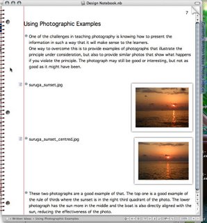
I work off line a lot, so it’s hard to blog my notebook. What I’ve done is use a program called (appropriately) Circus Ponies Notebook. I like it because it actually looks like a spiral bound notebook (see screen shot below) and allows me to page through it just as I would a paper notebook. I can also drag and drop photographs and other images into it. It indexes itself automatically, making it easy to locate words or concepts I’ve used. When I’ve finished a section, I then upload it to my blog when I’ve got everything ready.

Abandoning OmniGraffle (for the prototype)
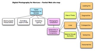
I started using OmniGraffle to lay out my prototype, but found that, while it was good for considering the overall shape of the Web site, it was more trouble than it was worth to use in laying out the site. I decided to go back to using Dreamweaver to do the layout and just take screen shots to illustrate it for my notes. This has gone relatively smoothly as it allows my testers to play with the actual functionality of the site rather than simply seeing how it will eventually look and function.
Tuesday, December 05, 2006
Prototype Development 1
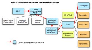
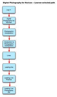
I’m a visual learner, but hopeless at drawing, so during the design concept stage, I used a lot of photographs that I already had as well as a number of flowcharts to help visualize how the design would work. For the prototype, I’m going to try something that’s very visual, but very quick to design. Using the program Omnigraffle (a Mac only flowchart program), I’ll create a mini illustrated version of the proposed Web site. While this is a good way to have potential users see what the site looks like, and how the instruction will be organized, it’s still not the same as navigating a real Web site, and I’m wondering if the feedback I receive will be sufficient to adjust the design to something that’s more useful.
If I want more feedback I may end up doing a limited web-based prototype, in particular to see how the inductive approach works with photography on the Web.
If I want more feedback I may end up doing a limited web-based prototype, in particular to see how the inductive approach works with photography on the Web.
Saturday, November 25, 2006
Instructional Objectives Redux
In our system specifications one of the instructional objectives for photographic composition was: “Given a photograph, the learner will be able to crop it to emphasize the lines (leading, vertical, horizontal, diagonal, or S-shaped) and make the photograph more effective.” I’m having second thoughts about this because cropping a photograph to improve the composition is not the same as taking well composed photographs. I’m wondering if I can find a measure of the learning outcome that reflects more closely what goes into composing photographs. This is one of the weaknesses of an online course that doesn’t have immediate feedback from an instructor. If it was possible to have learners submit example photos for instructor feedback, then the course would be much improved. However, it would also mean a significant increase in cost and one that would continue to escalate as the number of learners increased.
Thursday, November 23, 2006
Sample photograph for cropping
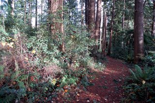
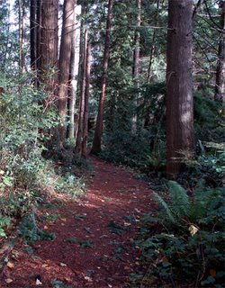
In the top photograph the path tends to lead the eye out of the photograph. Cropping it helps to create a photograph where the path leads in from the bottom left hand corner and draws the eye into the photograph. Note: the photograph itself is not particularly riveting. It was chosen to illustrate how cropping changes a photograph. It should also be noted that photographers should compose their photographs well when taking the photo, rather than relying on extensive cropping afterwards.
Tuesday, November 21, 2006
Theoretical underpinning
Gagne’s Conditions of Learning theory outlines nine instructional events and corresponding cognitive processes:
(1) gaining attention (reception)
(2) informing learners of the objective (expectancy)
(3) stimulating recall of prior learning (retrieval)
(4) presenting the stimulus (selective perception)
(5) providing learning guidance (semantic encoding)
(6) eliciting performance (responding)
(7) providing feedback (reinforcement)
(8) assessing performance (retrieval)
(9) enhancing retention and transfer (generalization).
Many of these fit well with what I’m trying to accomplish in this instructional tool.
Gagne, R. (1985). The Conditions of Learning (4th ed.). New York: Holt, Rinehart & Winston.
In Clark’s techniques for informational instruction she recommends that instructors first make a statement of the principle, then provide a set of varied examples that illustrate the application of the principle, followed by a number of non-examples that illustrate the result of failing to correctly implement the principle.
The function of lines in photographic composition
The mood of a photograph is influenced by the type of lines the photographer includes.
Vertical lines -- imply dignity, height, solemnity, strength, and grandeur. Found in trees, tall buildings or other structures, fences, people standing, mountains, etc. This impression is strengthened when the photo contains multiple lines.
Horizontal lines -- imply calm, tranquility, peacefulness, etc. Found in desert scenes, a lake, meadows with flowers, etc.
Diagonal lines -- add a sense of energy, dynamism and motion to photos.
Curved lines -- add beauty and charm to photographs. E.g. a curved path, bend in a river, or human body.
S-curve -- adds charm, strength, grace, and balance. It is a double curve in a river, path, fence, row of trees, etc.
Leading line -- is a line in a photo that often starts from one of the four corners and draws your eye to the main subject or centre of interest in the photo. It should be used with caution because if the leading line does not lead to an object which stops it, it may lead the viewer’s eye out of the photograph. The preferred starting point for a leading line is the lower left corner of the photograph, although not the exact corner. This is the area from which the eye finds it most natural to enter a picture.
Friday, November 17, 2006
Presenting information
In keeping with the photographic theme, I’m trying to devise a way to use as little text as possible (or at least to keep it to a minimum), but to explain through illustrative photographs.
I’m hoping this will allow me to use a more inductive style that will develop learners’ abilities to see as a photographer sees. Photographer Freeman Paterson, describes of one of the disciplines of photography as “learning to see”, which is something I want to develop in the learners. This is also why photographers often say the “make” a photograph rather than “take” a photograph.
Glossary -- to help overcome one of the constraints we identified, I’m creating a glossary of technical terms that learners can access from any page in the site.
“Rules” of photographic composition 2
Composition is an area of photography that includes many aspects. Given the relatively short period of instruction for this design concept and prototype, I’ll need to choose the concepts I’ll include and eliminate.
A number of possibilities include: rule of thirds, golden mean (same as the rule of thirds?), balance, texture, rhythm, mergers, space, shape, point of view, perspective, pattern, motion, line (horizontal, s-shaped, vertical, diagonal), framing, contrast & variety, simplicity.
In addition, a number of the areas some photographers contain in “composition” are covered in other areas of photography, e.g., depth of field, motion/shutter speed, etc.
